Color Theory and why it matters.
While studying at Wentworth Institute of Technology, one class immediately rose to the top as my favorite: color theory. I was fortunate to have an exceptional professor who brought the science of color to life in a way that was both fascinating and inspiring. Her lessons were filled with hands-on experiments that showed how our eyes can be wonderfully deceptive—how the very same color can appear completely different depending on what surrounds it or where it’s placed. This is known as Simultaneous, Successive, and Reverse Contrast.
I was especially captivated by demonstrations that revealed how a single color could transform based on the details of an interior space, from lighting and scale to adjacent materials and finishes. Watching those subtle shifts happen in real time was a defining moment for me. It was then that I realized color wasn’t just a design element—it was a powerful tool, and I knew I wanted to spend my career working with color and décor in a meaningful way. It's for this reason that when it came to creating a name for our design business in January 2009, that it had to be color theory Boston.
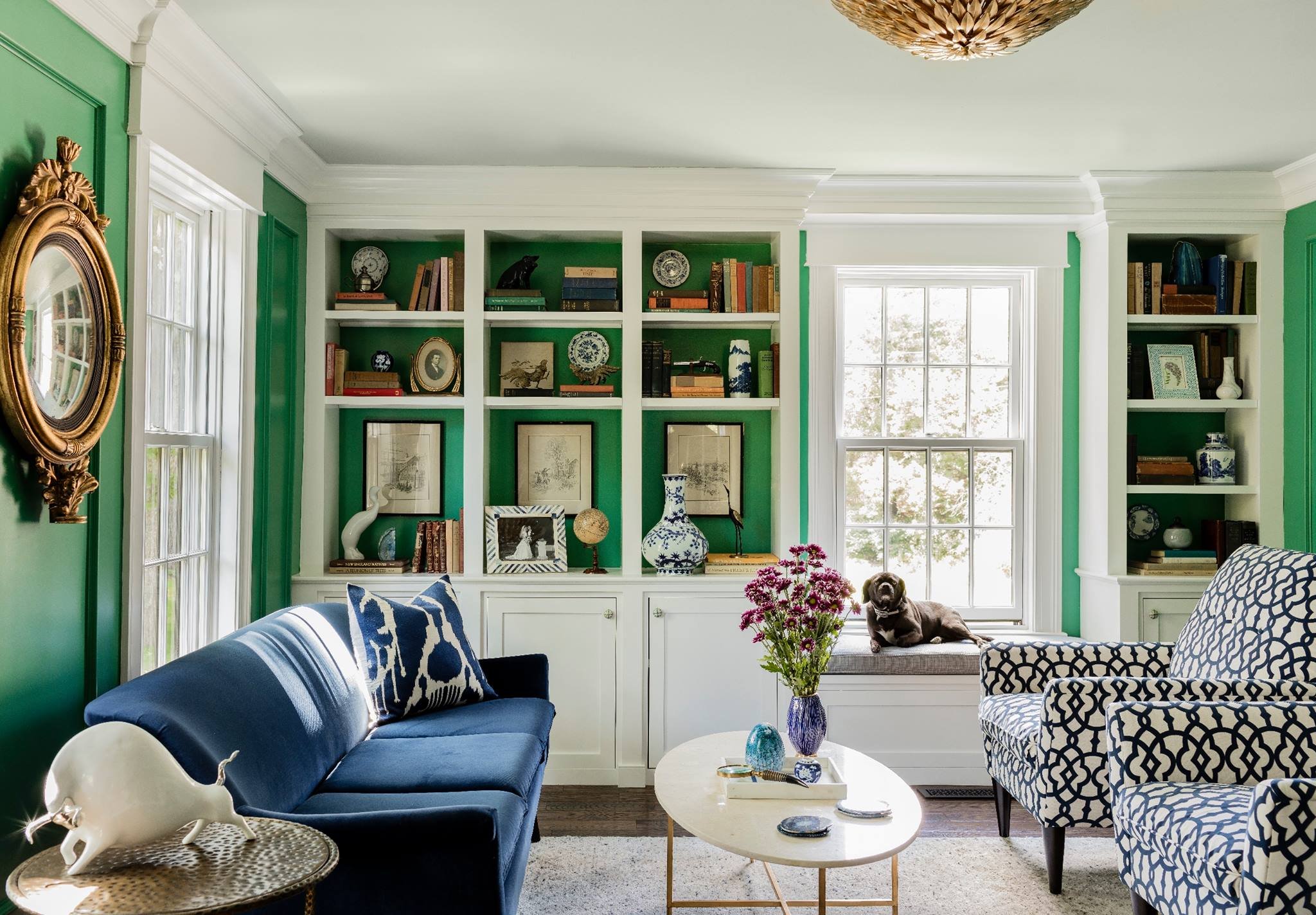
Color theory is the study of how colors interact with one another and how they influence the way we feel in a space. In interior design, color is more than a visual choice—it plays a direct role in shaping mood, energy, and comfort. Warm colors like soft reds, terracottas, and warm neutrals can create a sense of coziness and connection, while cooler tones such as blues and greens are often associated with calm, focus, and relaxation. On the other hand, overly saturated or poorly balanced colors can feel overwhelming or draining, which is why thoughtful selection and proportion are essential.
The way a color is perceived is deeply influenced by the architecture of the room itself. Natural light, for example, can dramatically alter how a paint color appears throughout the day. A color that feels bright and airy in a sun-filled room may appear muted or heavy in a space with limited daylight. Room size and wall height also matter: lighter hues tend to make smaller rooms feel more open and expansive, while darker tones can add intimacy and grounding in larger or taller spaces when used intentionally.
Furniture and finishes add another layer to how color functions in an interior. Upholstery, wood tones, metals, and textiles all reflect and absorb light differently, creating subtle shifts in color perception. A neutral wall color can feel warm or cool depending on the surrounding furnishings, and a bold accent color may read differently when repeated across fabrics, cabinetry, or decorative elements. These layered applications allow the same color to create multiple visual impressions within a single room.
Ultimately, successful color design is about balance—between emotion and function, aesthetics and environment. By considering how color interacts with light, scale, and materials, interior spaces can be tailored to support well-being, productivity, and comfort. When applied thoughtfully, color becomes a powerful tool that enhances how a space looks and, more importantly, how it feels to live in every day.
Did you enjoy this topic? If so here are two articles that provide in depth information from leading publications.
Architectural Digest: “Does Paint Color Really Affect Your Mood?”
House Beautiful: “Psychologists Explain Why You Should Avoid a ‘Hostility Color Palette’”